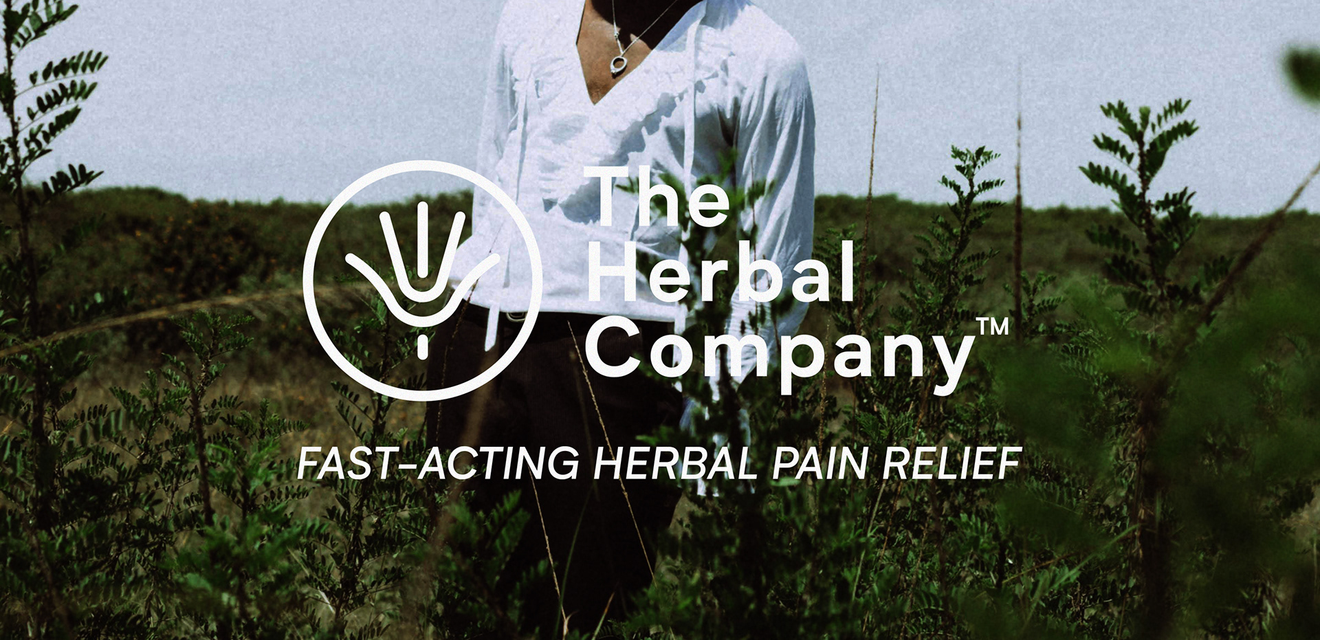
The Herbal Company
Brand Identity · Packaging · Campaign
Brand Identity · Packaging · Campaign
The Herbal Company was founded by a pharmacist and a co-founder with an instinctive understanding of the earth and natural substances, paired with traditional healing knowledge passed down through the pharmacist's grandmother. Modern science on one side, generations of natural knowledge on the other.
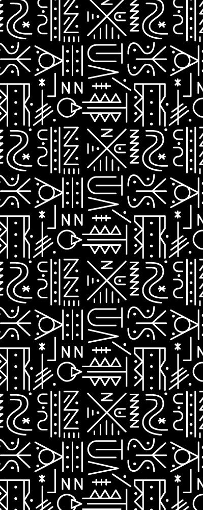
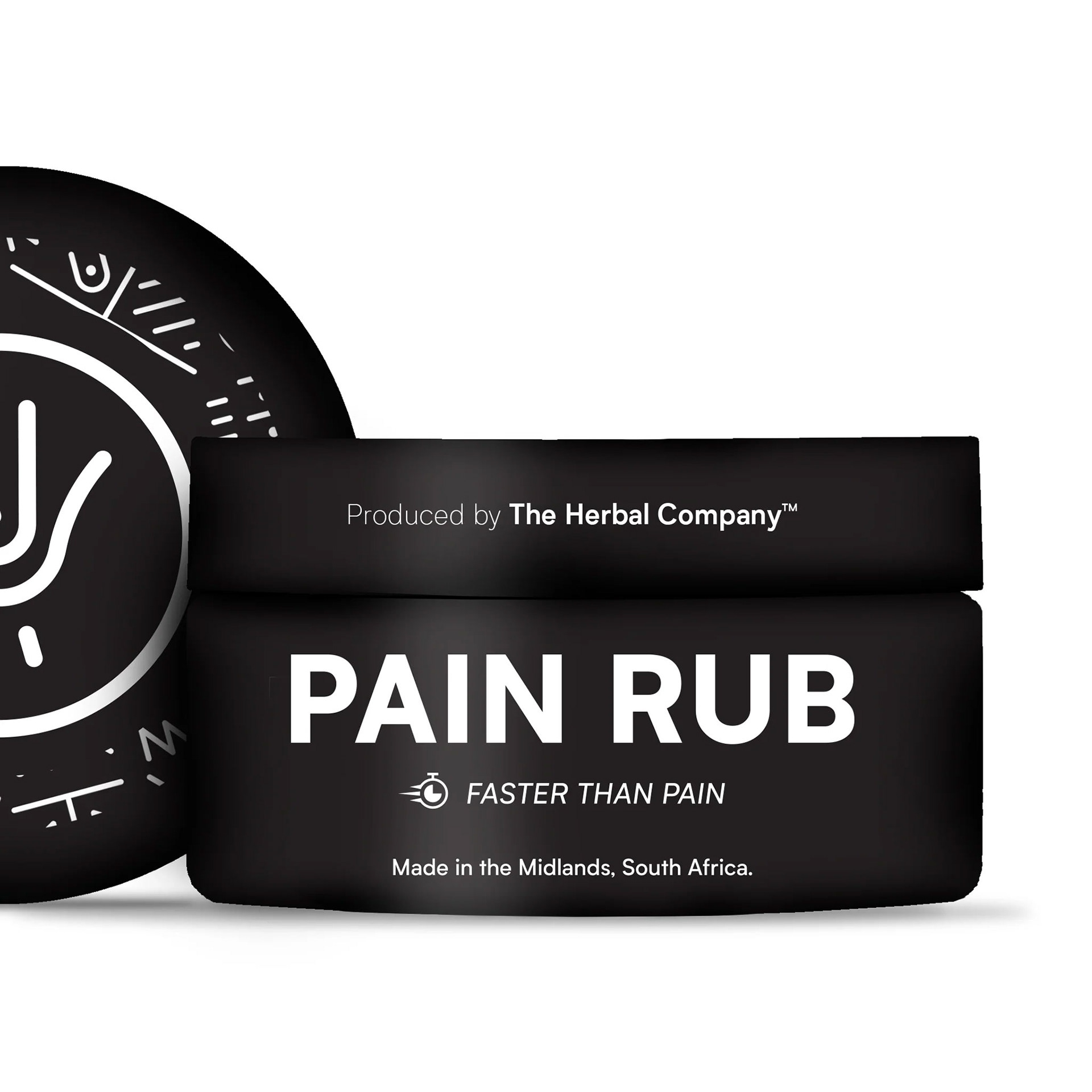
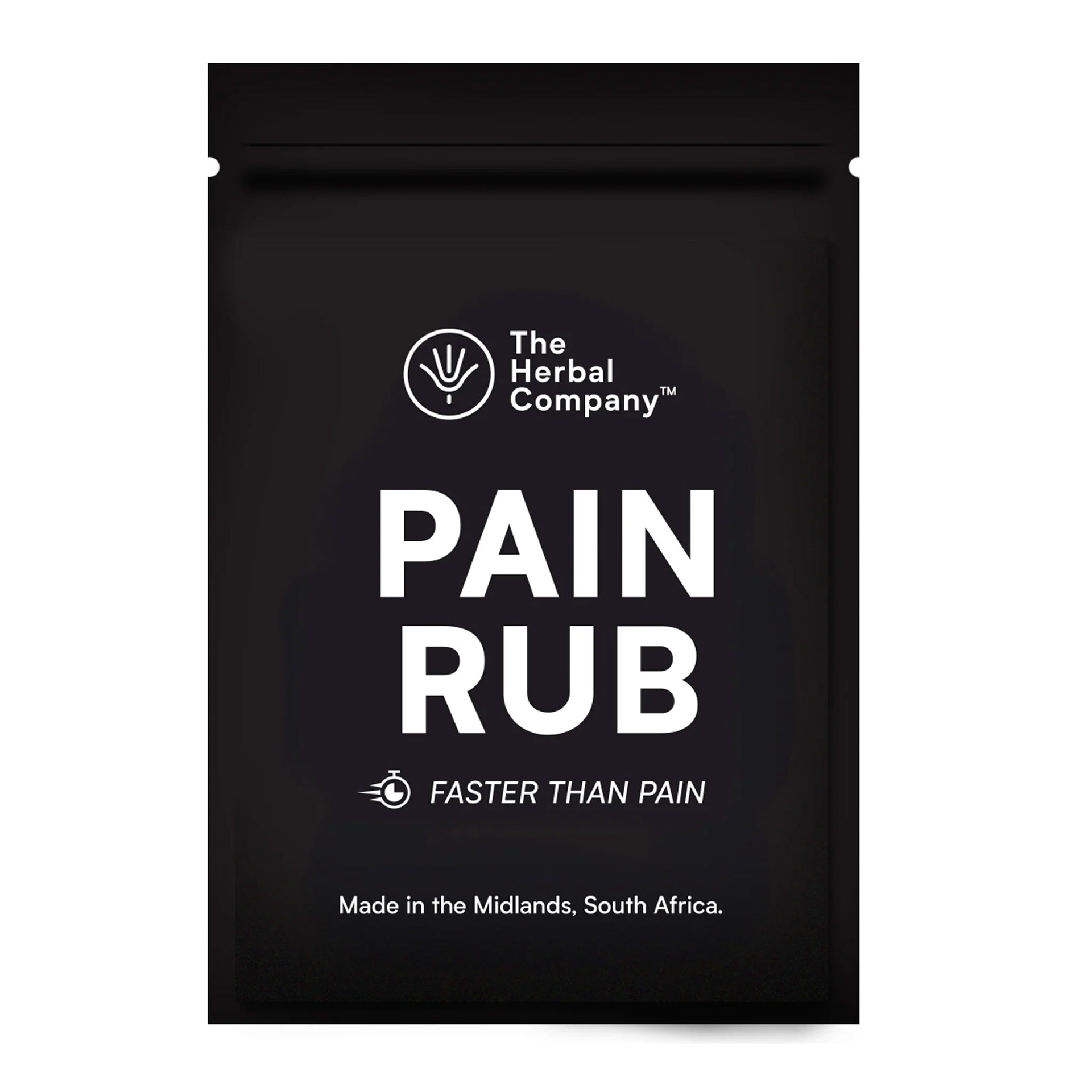
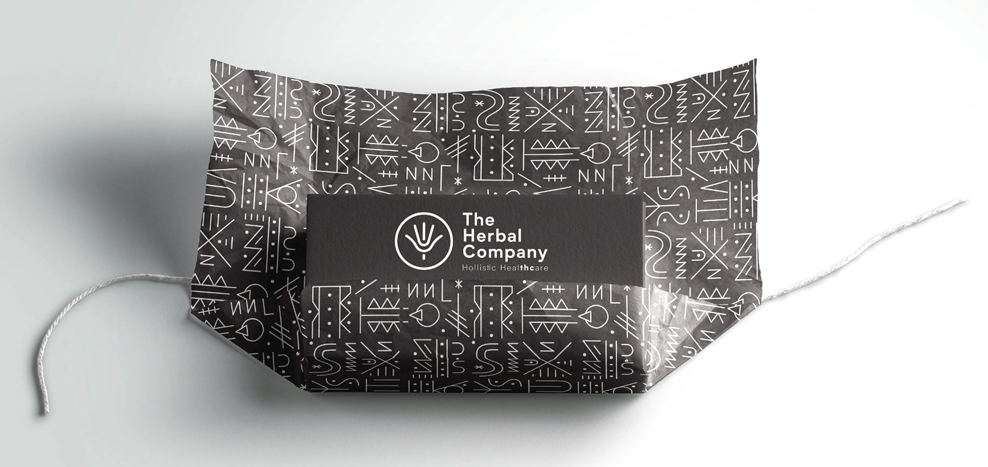
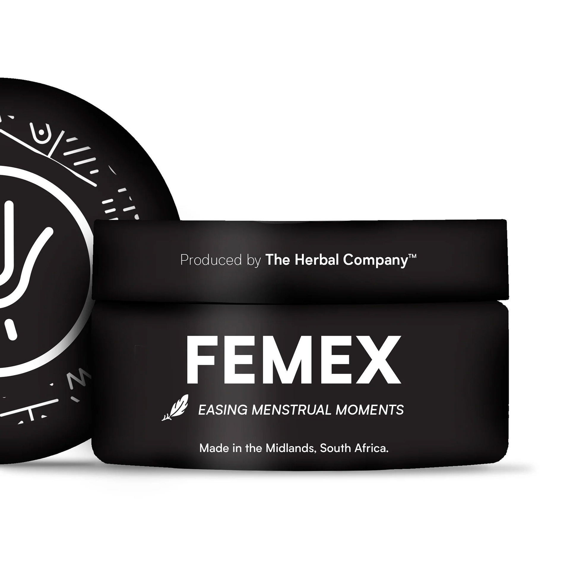
I developed the full visual identity and packaging system, blending earthy tones and clean typography with a system of symbols drawn from traditional healing iconography — each one carrying its own meaning, working as a visual vocabulary rather than decoration.
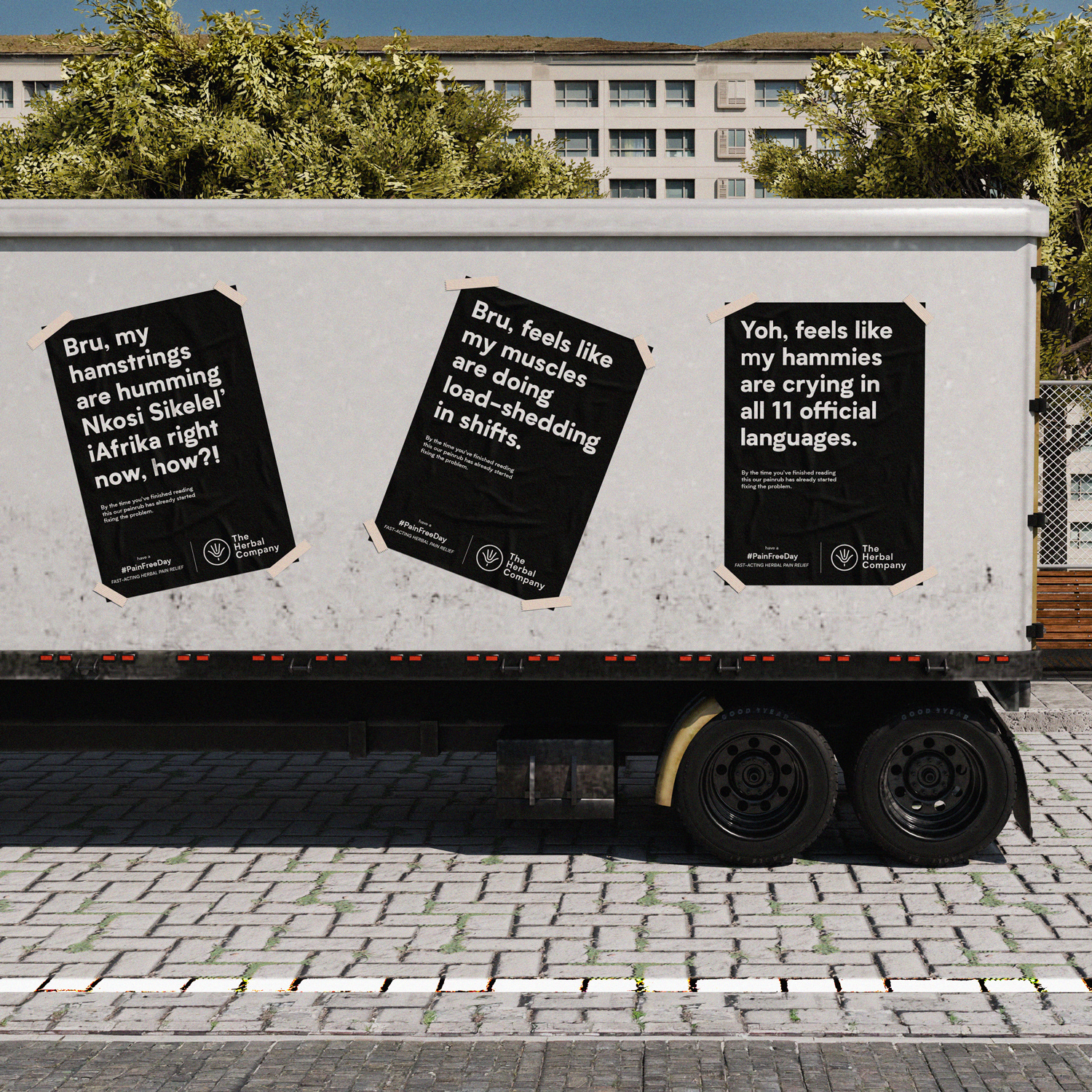
I later wrote and art directed the brand's pain-relief campaign, built around how South Africans actually talk about being sore rather than how a pharma ad usually sounds.
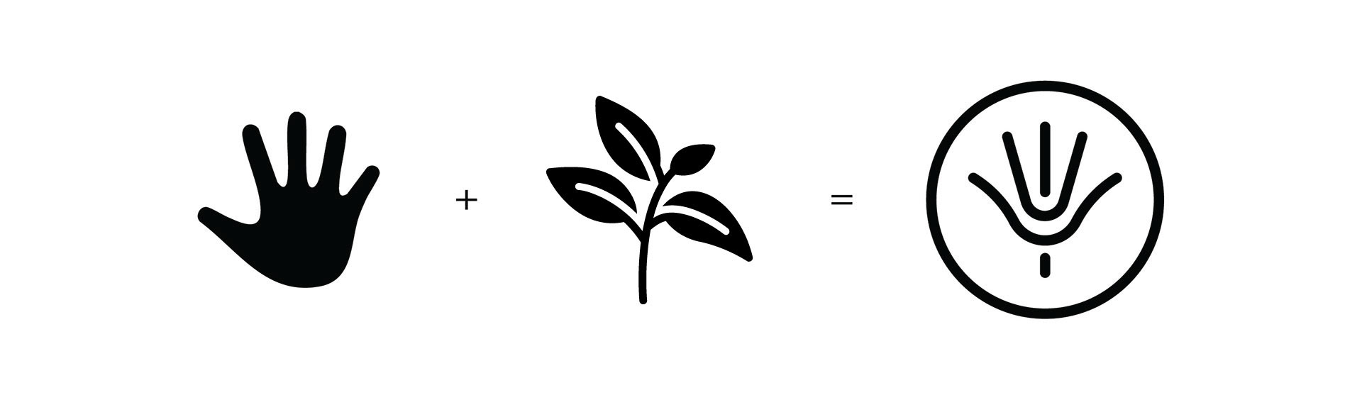
Logo Inspiration.

Traditional Symbols.