Brand Identity · Creative & Art Direction · Brand Strategy · Visual Identity · Campaign Concept
The business was previously known as Selective Loans - a name and identity that did little to build trust in a sector already associated with predatory lending. As a micro-lending business operating in the informal sector, it faced a real risk: a loan is intangible, so the brand identity itself would carry the entire weight of how the business was perceived.
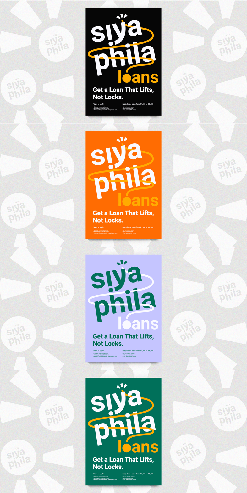
I led the creative direction, building the brand around the meaning of Siyaphila - "we are living, we are thriving." That became the foundation for the name, the voice, and the look.
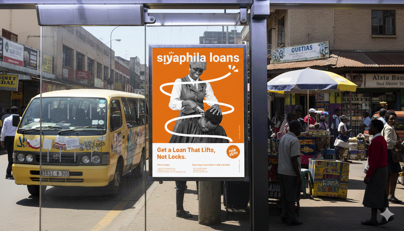
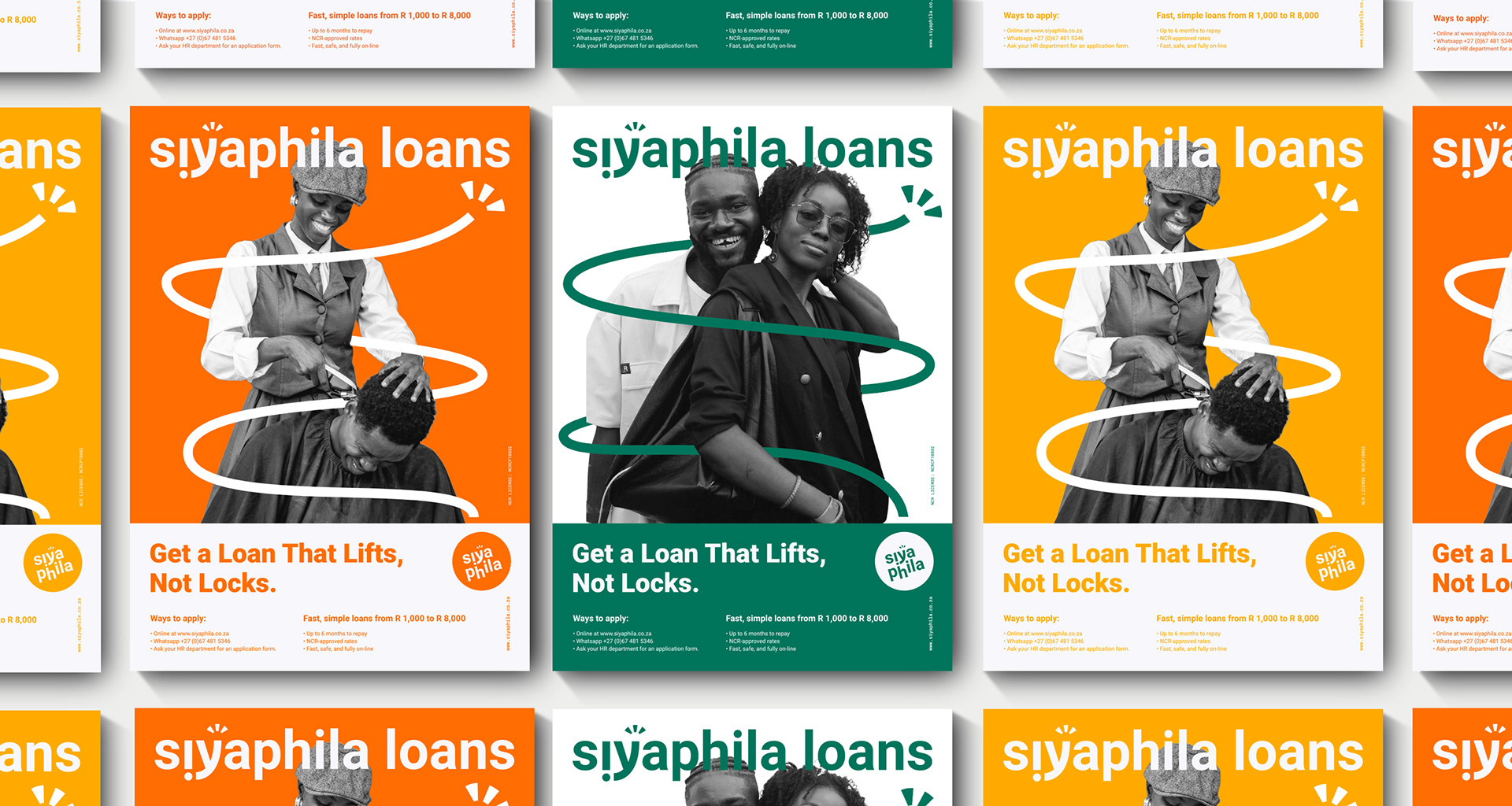
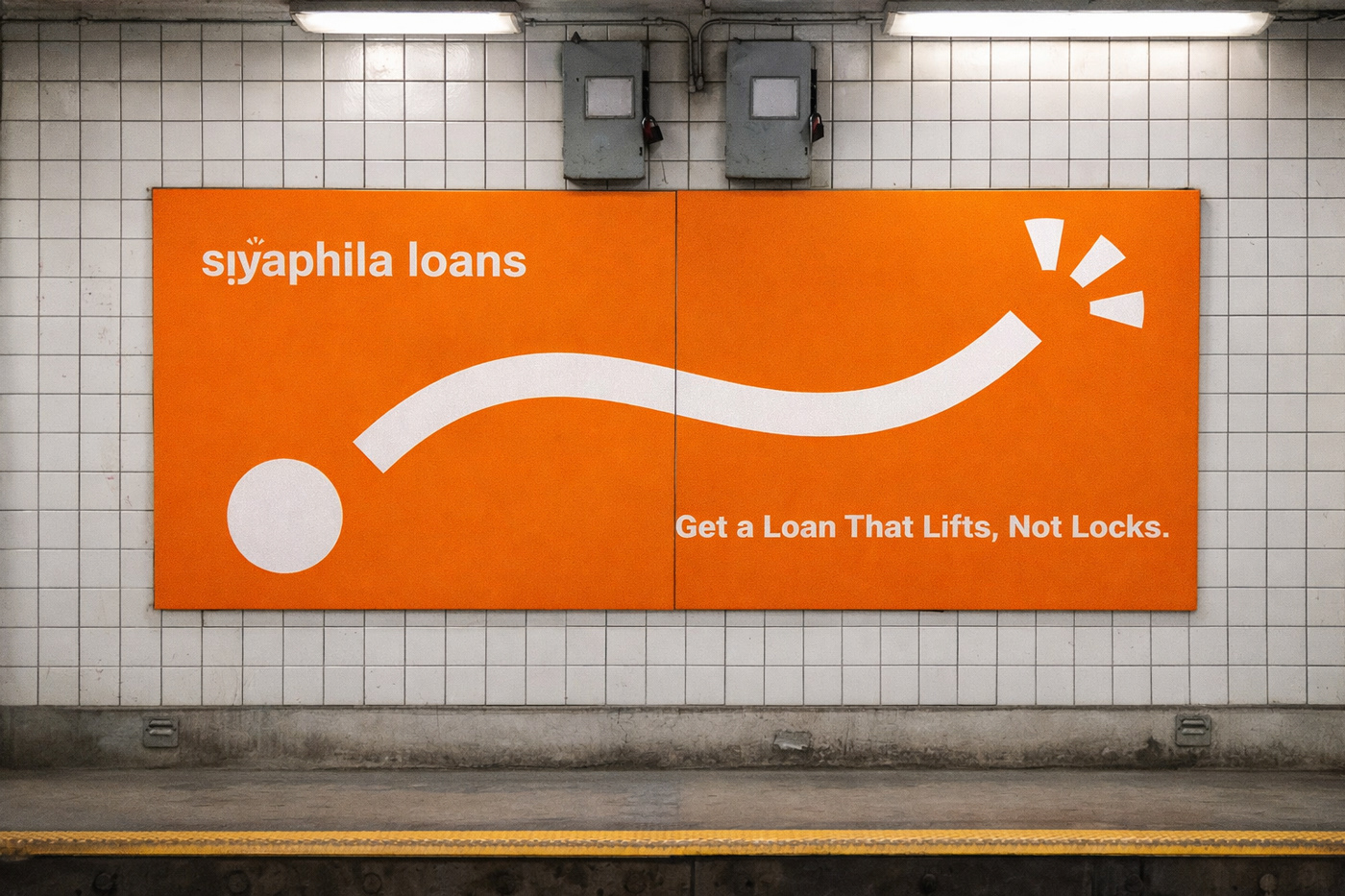
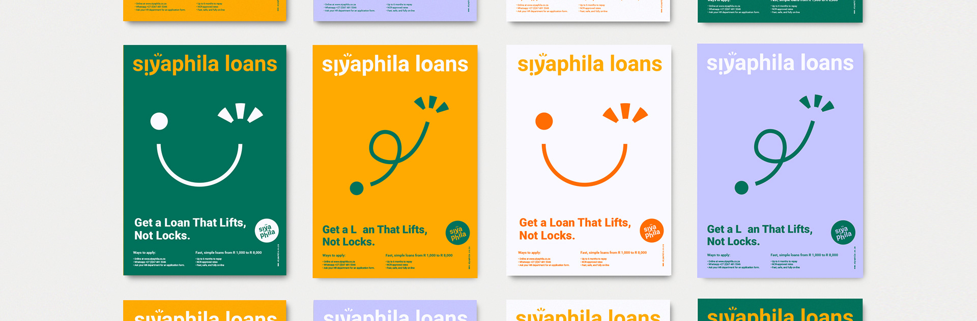
The tagline, "Get a Loan That Lifts, Not Locks," names the fear people already have about lending - and answers it in five words.
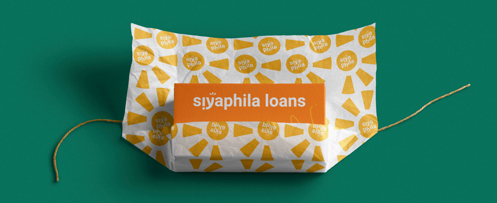
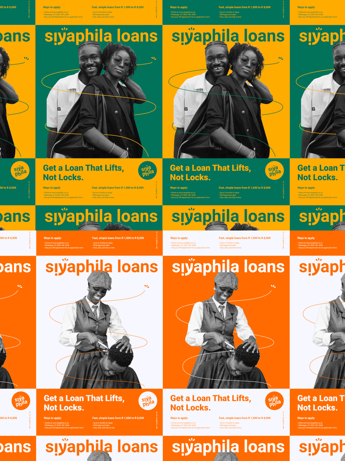
A warm, sunrise-inspired palette and clean, legible type carry the optimism, while human-centred imagery keeps the focus on dignity, not finance.
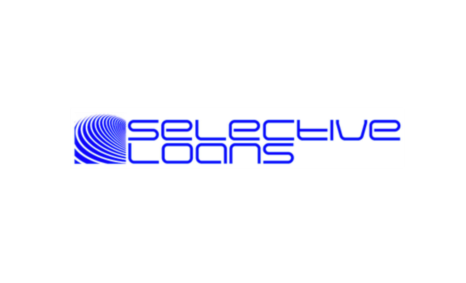
Original identity (Selective Loans).

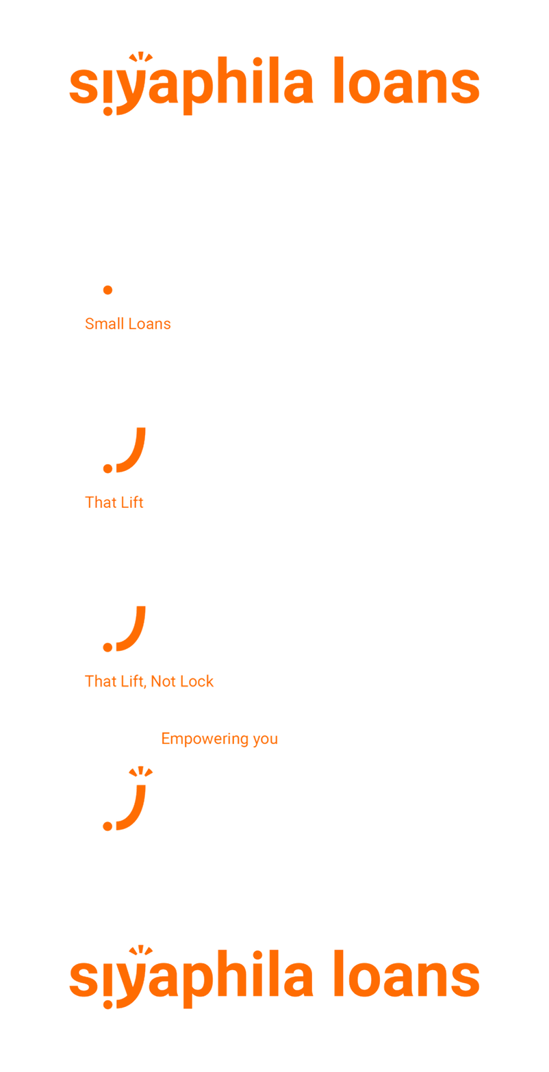
New identity (Siyaphila Loans).
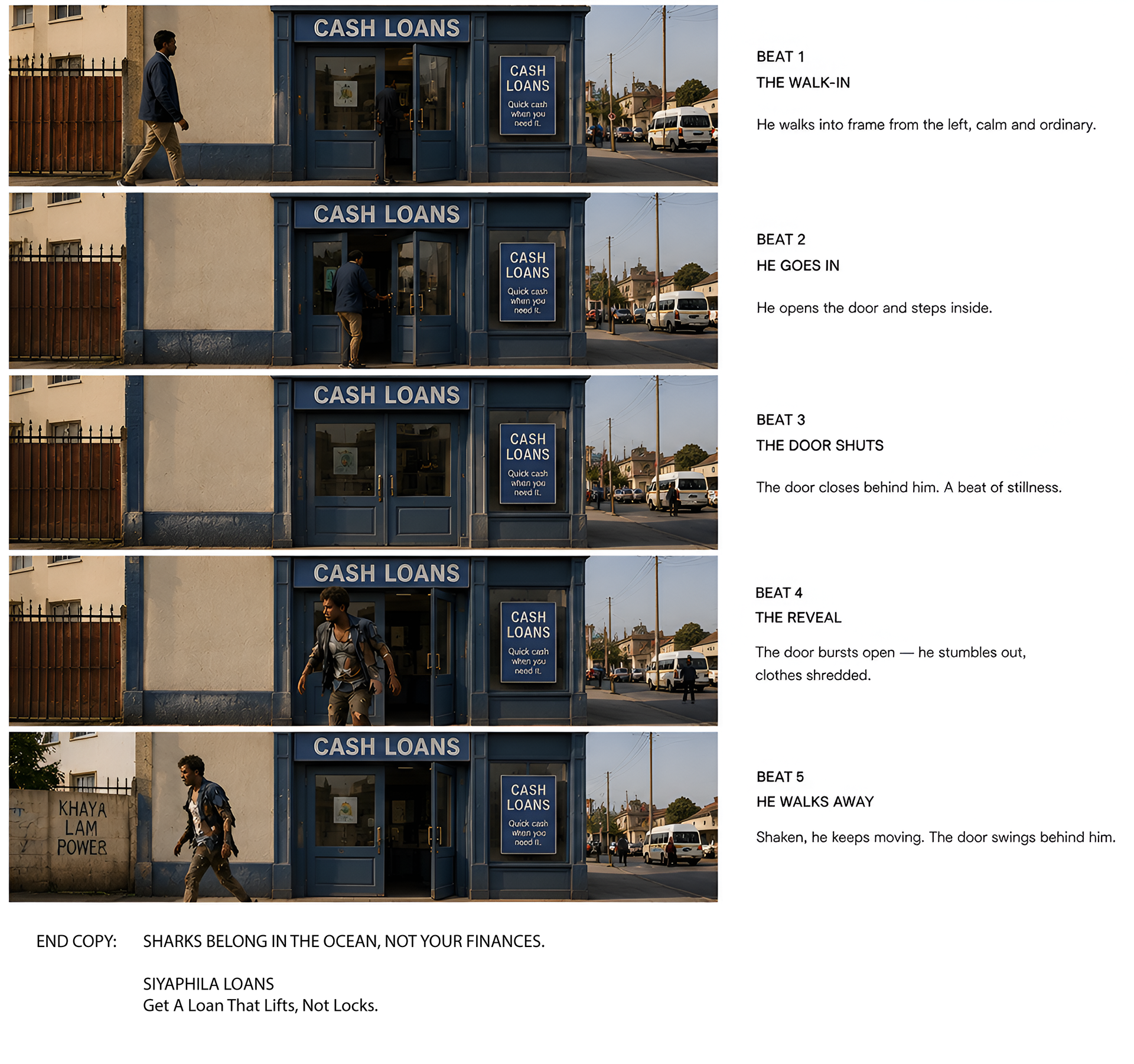
Campaign: "Sharks Belong In The Ocean"
South Africans already call predatory lenders "loan sharks." We made it literal - a man walks into a "Cash Loans" shopfront and walks out looking like he's been mauled. No dialogue, just the joke, then the line:
Sharks belong in the ocean, not your finances.
Get a loan that lifts, not locks.
It's built for social - sharp enough to stop a scroll, and honest enough that both employees and employers get the point fast.