Brand Identity · Creative & Art Direction
BikeMarket's old identity was a generic, hand-stamped "rustic craft" look - the kind of visual shorthand thousands of small businesses used at the time. It said nothing about bikes, and gave buyers no real reason to trust a peer-to-peer marketplace with their money.
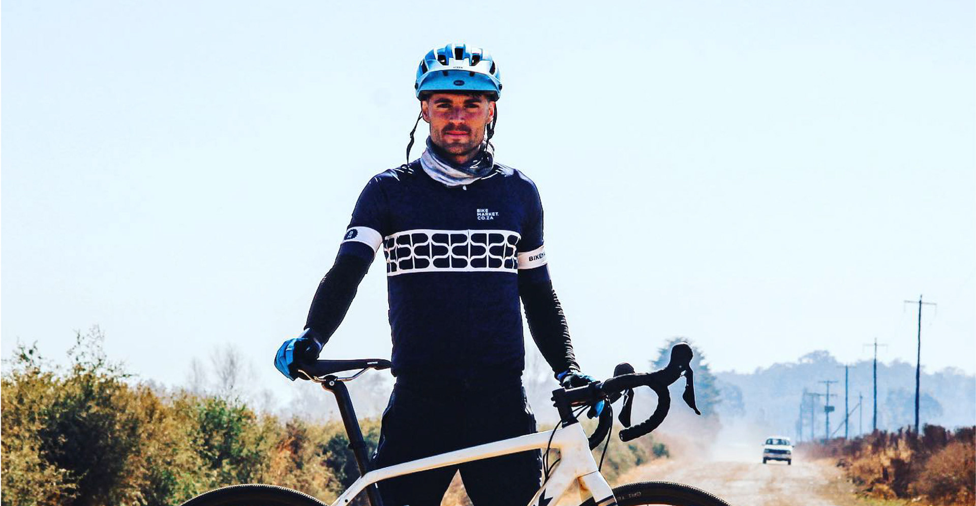
I led the creative direction on the rebrand, building the new identity around the business itself. The custom wordmark takes its cues directly from the weld marks on a steel bike frame, and a supporting pattern doubles as both tyre tread and speech bubble - tying together movement and community, the two ideas BikeMarket is actually built on.
That same thinking extended into BikeMarket's "Ready to Ride" quality system - a clear, visual checklist (inspected, rebuilt, wheels trued, bearings checked) that turns trust into something a buyer can actually see, not just take on faith.
The result is a confident, modern identity - applied across kit, vehicles, in-store tagging and campaign work - built to make a peer-to-peer marketplace feel as trustworthy as the bikes it sells.
Original 2018 identity.
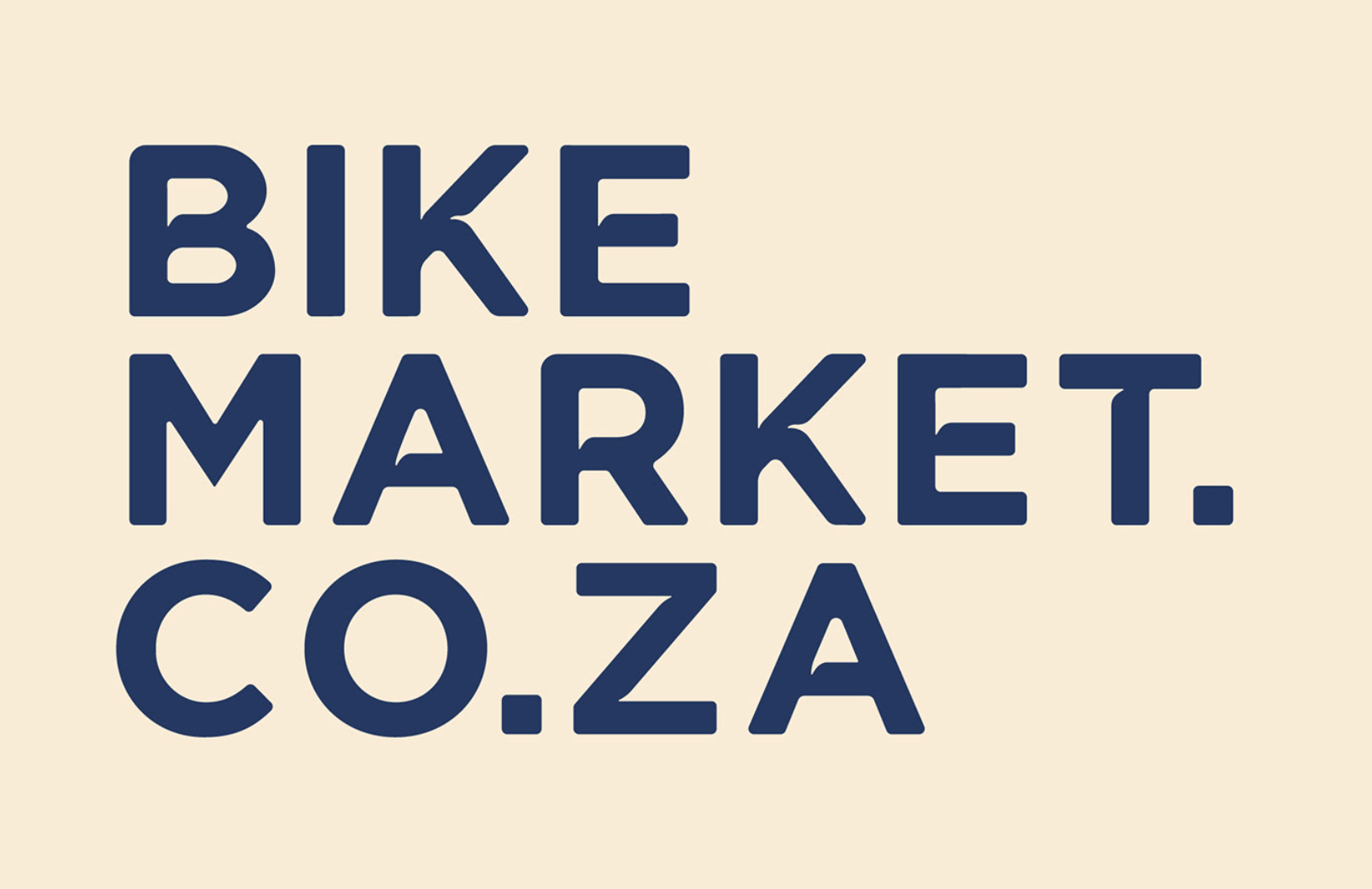
New Identity.

Logo inspiration.